[Week 11] Learning Mixpanel: Insights report
![[Week 11] Learning Mixpanel: Insights report](/content/images/size/w1200/2026/02/e457fa6b-d6bc-44b7-bfef-6abc114db6ab_915x323.png)
Introduction
Welcome to Week 11 of Learning Mixpanel. I’m Ansh, a Mixpanel Certified Partner. I’ve had the privilege of working with 60+ startups, helping them set up their analytics infrastructure and gain actionable insights using Mixpanel.
Curious about my work? Check out my website for case studies, testimonials, and more details about what I do.
Tired of Mixpanel data going wrong - events missing, properties breaking, or random spikes?
Pravix makes it simple to detect these issues and keep your data clean.
Today, I am going to talk about how to create reports via the Insights report section.
Let’s get into it
Insights Report
If your preferred consumption is audio visual - access the video on Youtube
The Insights report helps answer questions like:
- How many users bought a product today?
- What is the distribution of product categories that users are purchasing, and how is it changing over time?
- What is the product’s growth rate?
Insights report has 3 key parts. Letʼs dive into each:
The Top Bar

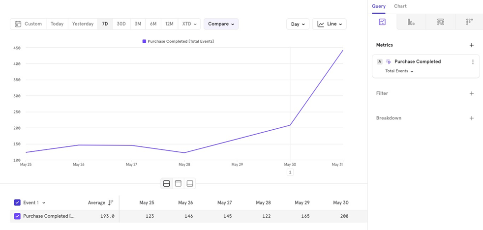
Date Selector
The Date Selector lets you pick a date range for the data you want to view. You can also:
Select a custom range like “Last 7 days, ending 3 days agoˮ by clicking Custom → Last Choose the number of days, then use the Ending option to add an ending.
Choose options like Week to Date or Month to Date for charts that automatically reset. For instance, use Month to Date if you always want to see data for the current month.
Compare
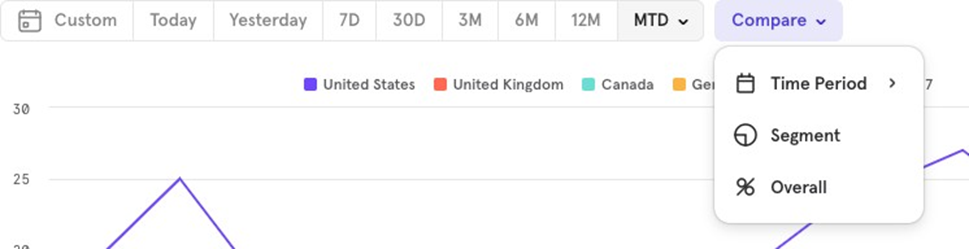
The Compare option lets you compare current data with a previous period, a specific segment, or as a percentage of the overall total.
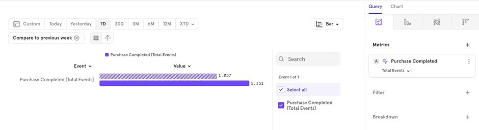
Compare with Previous Time Period: If you’re viewing data for the last 7 days and want to compare it to the previous 7 days, choose Compare → Time Period → Previous Week.
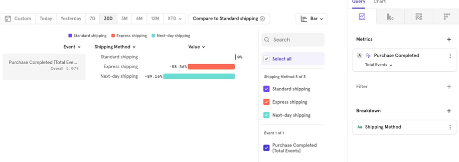
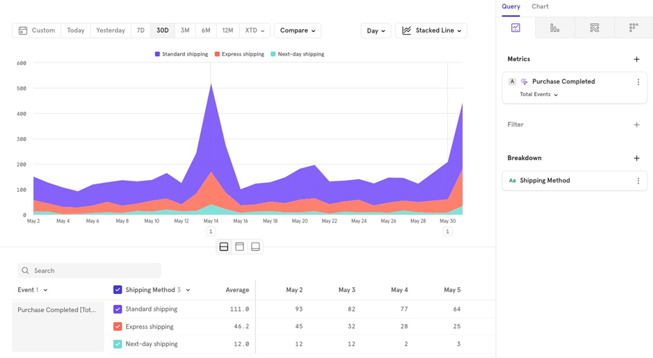
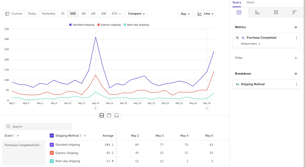
Compare with Specific Segment (only works with Breakdowns): For example, on an e-commerce platform, you might want to compare Express shipping to Standard shipping. Choose Compare → Segment → Standard Shipping. This allows you to see that Express shipping is 58% less than Standard shipping.
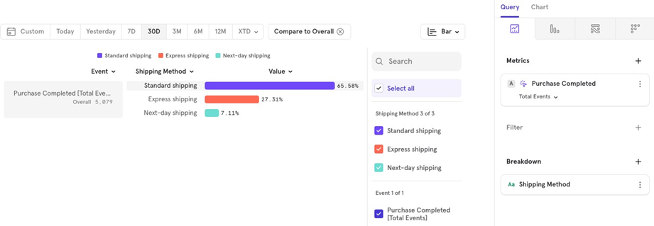
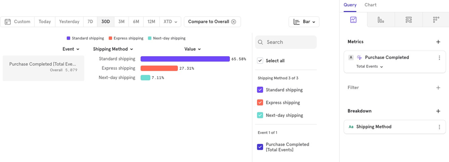
Compare with Overall: If you want to see the distribution of all shipping methods as a percentage of the total, choose Compare → Overall. For example, Standard shipping accounts for 65% of all completed purchases.
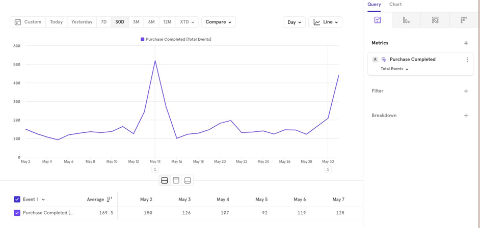
Minute/ Hour/ Day/ Week/ Month
This option allows you to group your data by different time intervals. For example, you can view completed purchases over the last 30 days, either on a daily or weekly basis.
Daily
Weekly
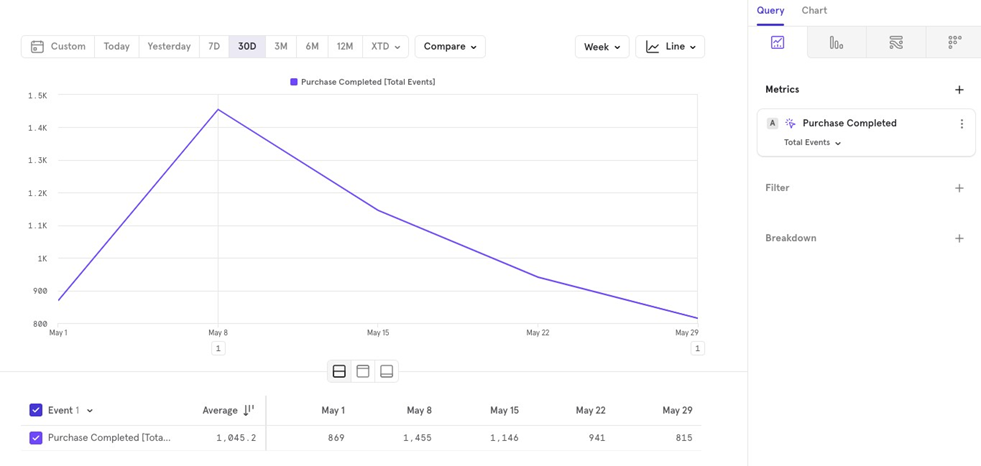
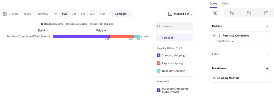
Chart Types
You can choose from a variety of charts, each serving a specific purpose:
Line/ Column Chart: Use this for daily or monthly time series data.
Stacked Line/Column Chart: Useful for seeing how the distribution changes over time.
Bar Chart: Great for comparing percentages to the overall, or looking at overall numbers instead of a time series format.
Stacked Bar Chart: Best when you want to study distribution in a stacked manner.
Pie Chart: Similar to Bar Chart, useful for viewing overall numbers instead of a time series format.
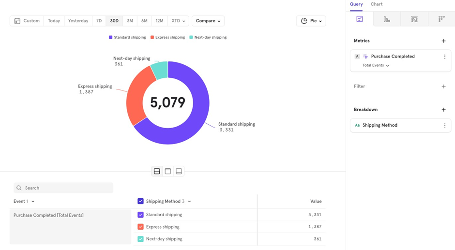
Table: Use this for a simple tabular view.
Metric: Choose this if you only need to see a single number without extra details.
The Metrics
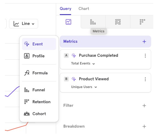
This is where you choose, what data want to look at, and in what fashion.
You can also visualize multiple events, user profiles, formulas and cohorts together in the same chart.
This allows you to compare different data points or groups side by side for a clearer understanding of trends and user behavior.
The Metrics - Events
You can choose to visualize an Event (user action), in a multitude of ways.
Letʼs take “Purchase Completedˮ event, and look at various ways in which we can visualize details from this event.
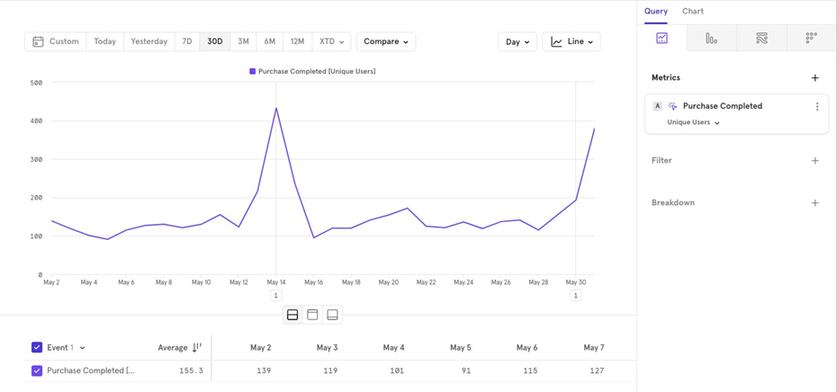
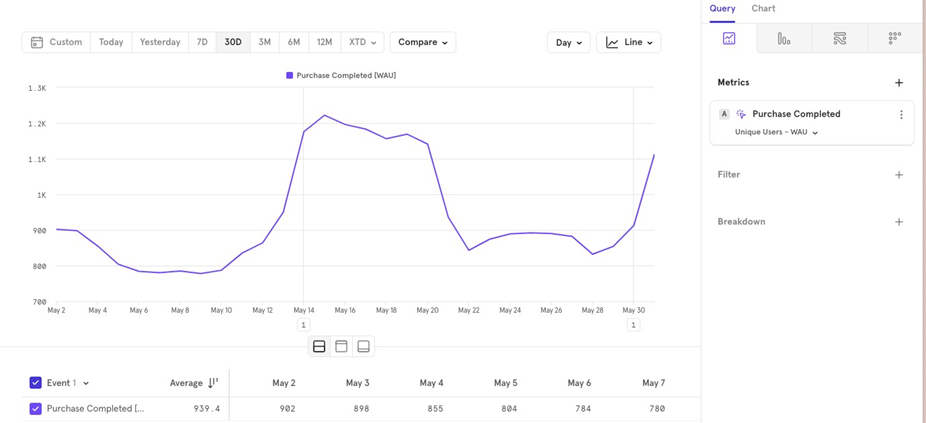
Unique Users
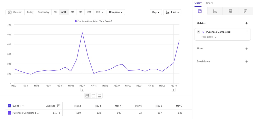
- Number of Unique Users: This shows how many unique users performed the event in the last 30 days, aggregated on a daily basis.
- DAU/WAU/MAU: For understanding weekly active users WAU on a daily level, the chart will show daily data but look back 7 days to calculate active users. The same applies for monthly MAU and daily DAU active users.
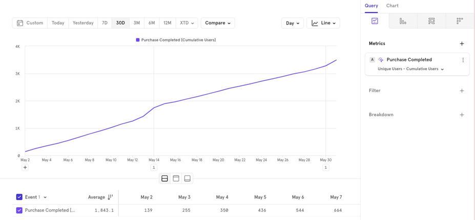
Cumulative: To see growth over the last 30 days, the cumulative graph starts at 0 and adds each dayʼs value to the previous ones, giving a total for the current day, and a growth trajectory.
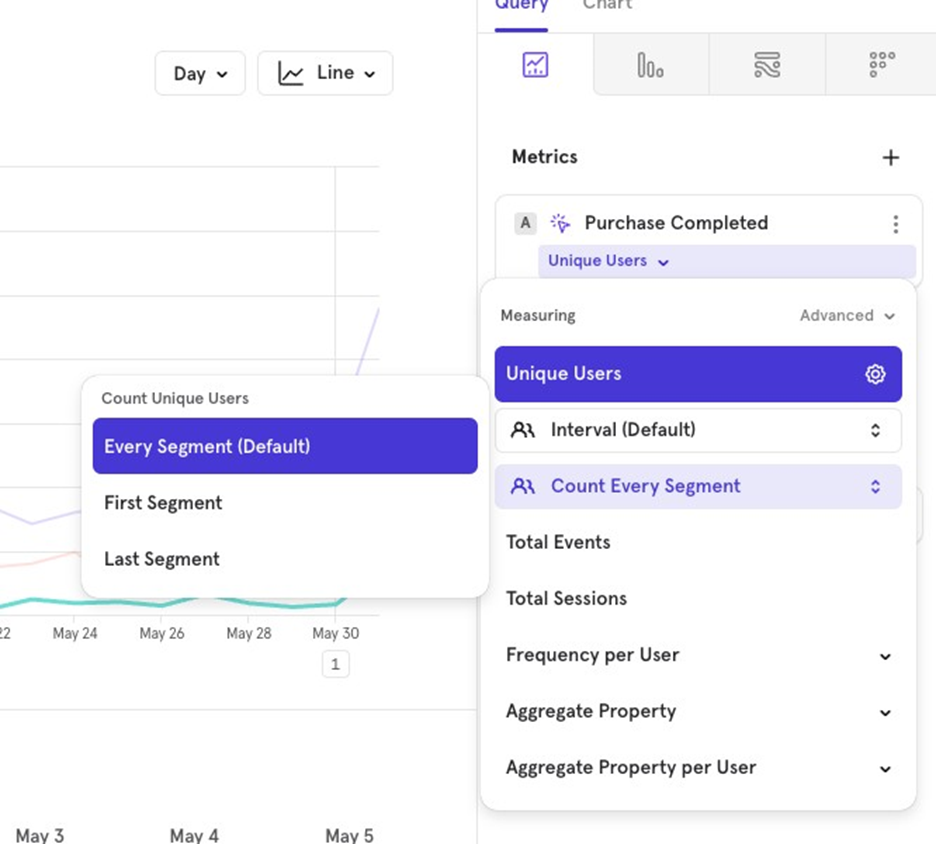
- Segment Count: If you want to analyze users making a purchase, broken down by Shipping Method, Mixpanel will count users in both shipping methods if they made multiple purchases on the same day (depending on your aggregation time period). To avoid double counting, you can choose between First Segment or Last
Segment:
- First Segment Counts the user only in the shipping method from their first order of the day.
- Last Segment Counts the user only in the shipping method from their last order of the day.
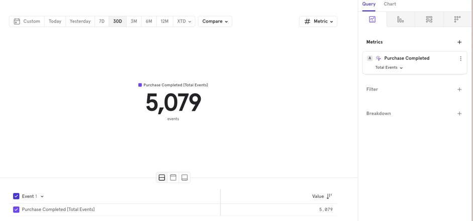
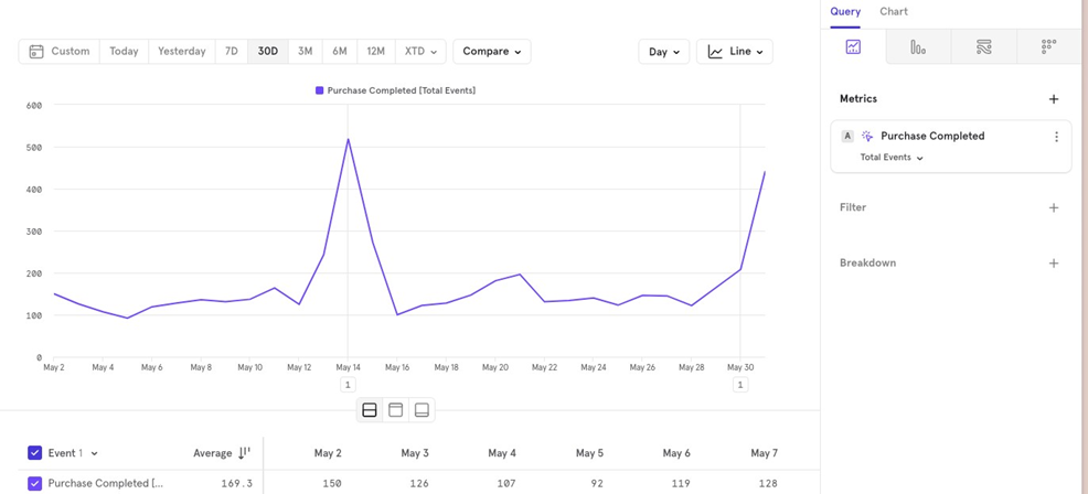
Total Events
This counts the total number of “Purchase Completed” events over the last 30 days, aggregated daily.
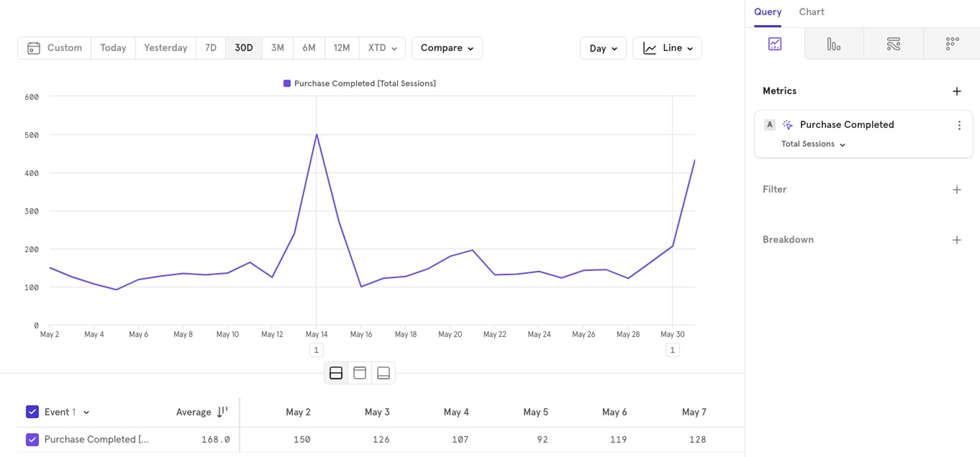
Total Sessions
This counts the total number of sessions where the “Purchase Completed” event occurred in the last 30 days, aggregated daily.
Note: If multiple events were fired for the same user in a single session, it will count as one entry on the chart.
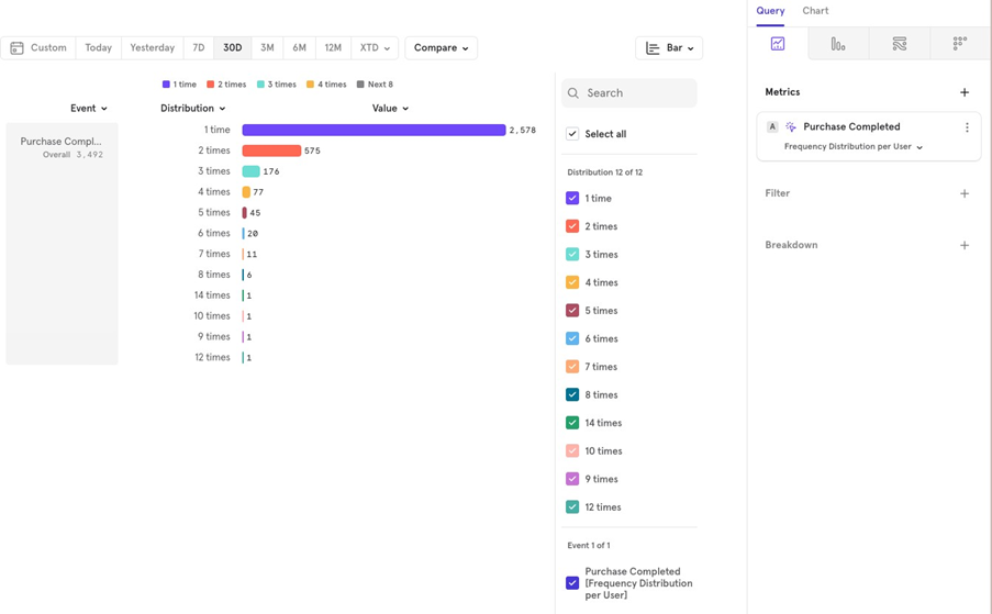
Frequency per user
This metric calculates how many times a user performed the “Purchase Completed” event over the last 30 days. Then, an aggregation can be applied on top of it.
Daily Interval (Line Chart): Calculates how many times each user completed a purchase for each day in the last 30 days.
30-day Total (Bar Chart): Calculates how many times each user completed a purchase over the entire 30 days, not broken down by day.
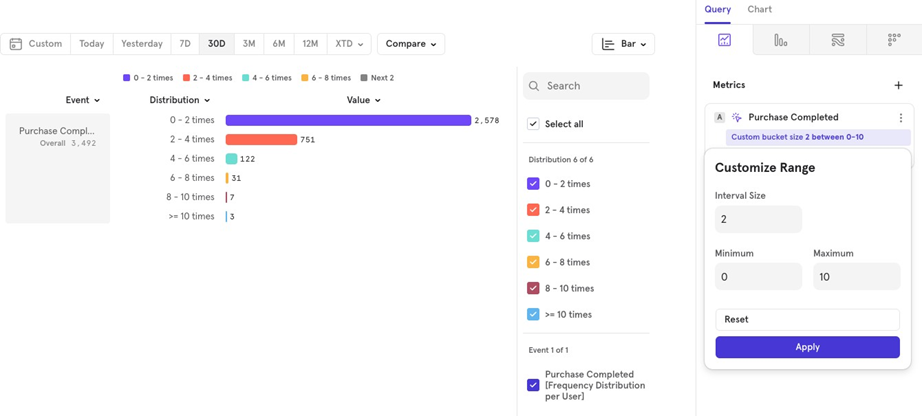
- Distribution: Shows the distribution of users who did the event 1 time, 2 times, and so on. You can also customize the bucket intervals. Click the 3 dots next to the event name Customize Range Choose your intervals.
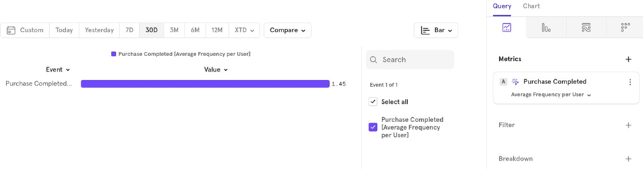
- Average: The average number of times users performed this event over the last 30 days.
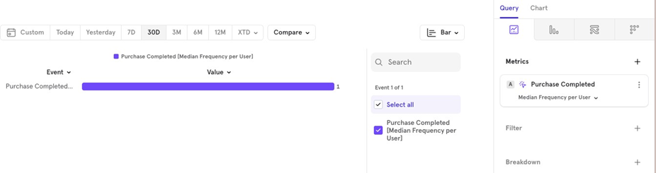
- Median: The median number of times users performed this event over the last 30 days.
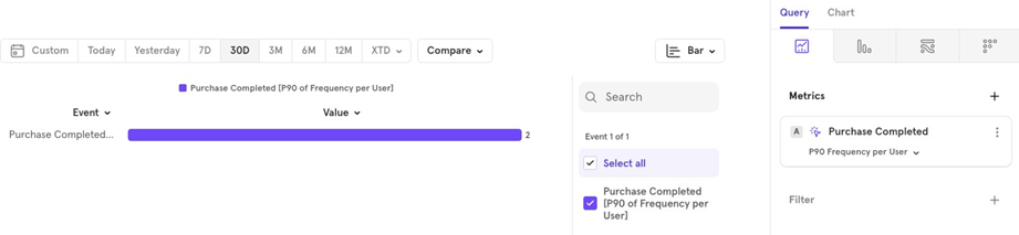
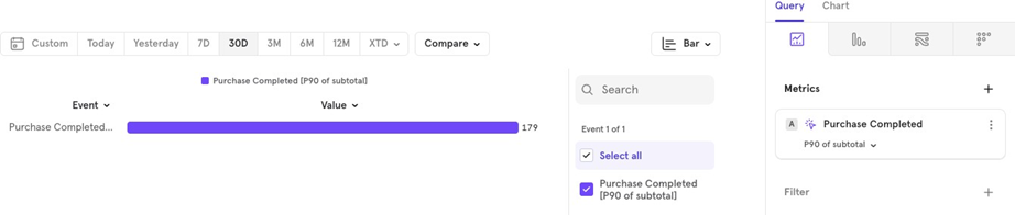
- Percentile: For example, the p90 value shows the 90th percentile value for the distribution.
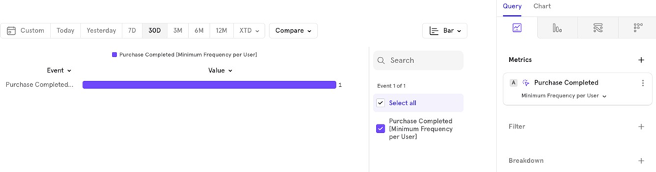
- Minimum The minimum number of times the event was performed by users in the last 30 days.
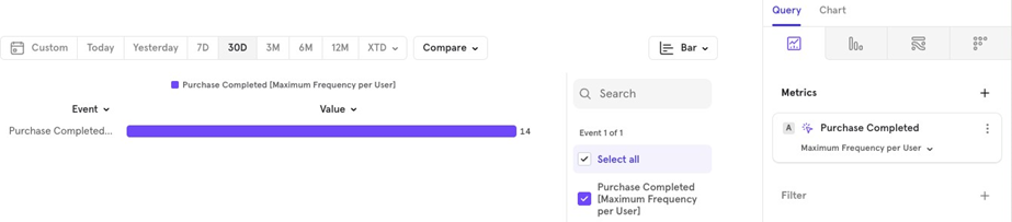
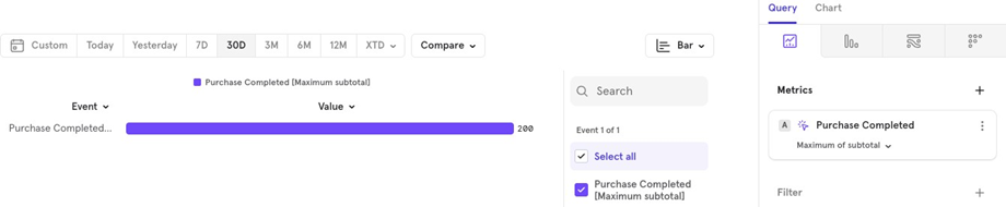
- Maximum The maximum number of times the event was performed by users in the last 30 days.
Aggregate Property
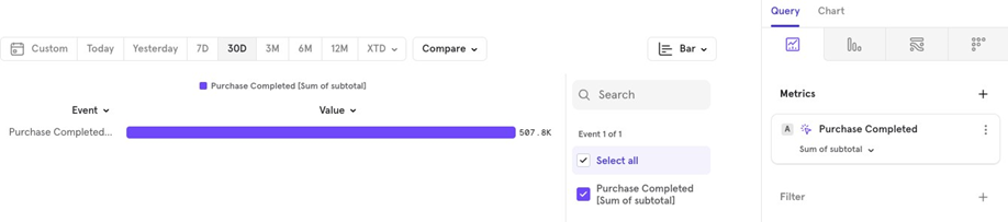
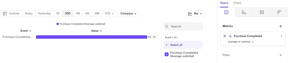
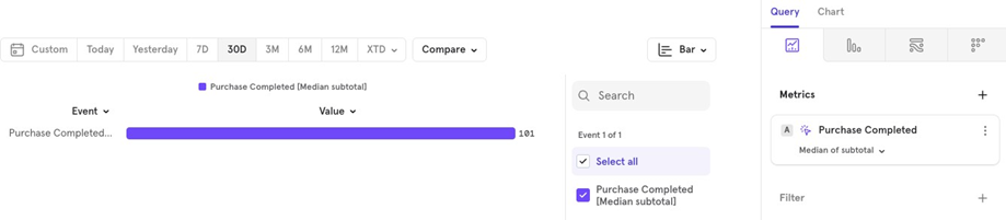
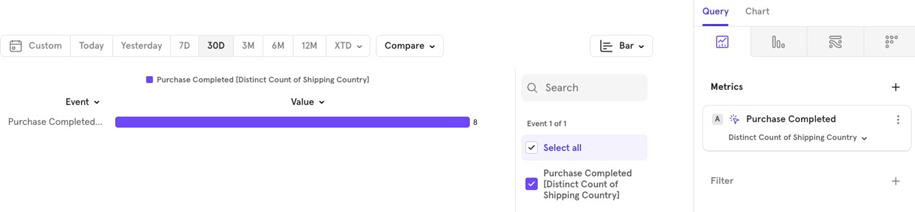
The Aggregate Property lets you calculate totals and other aggregations for a specific property. For example, you can find the total value of orders for the “Purchase Completed” event in the last 30 days.
Sum Total order value over the last 30 days.
- Average Average order value over the last 30 days.
- Median Median order value over the last 30 days.
- Distinct Count For example, how many unique countries placed orders in the last 30 days.
- Percentile Shows values at a certain percentile, like the p90 90th percentile) of all order values.
- Minimum The lowest order value over the last 30 days.
Aggregate Property per User
This feature lets you apply two levels of aggregation: one for each user and one on top of all users. For example, to find the average order value per user over the last 30 days.
Since users may make multiple purchases, you first need to sum the order values for each user, then calculate the average across all users.
In Mixpanel, you can do this by:
- Selecting Aggregate Property per User.
- Choosing average as the 1st aggregation (applies to the total order value for all users).
- Choosing sum as the 2nd aggregation (applies to each userʼs order value, and sums it up).
- Selecting the property to aggregate (like order value).
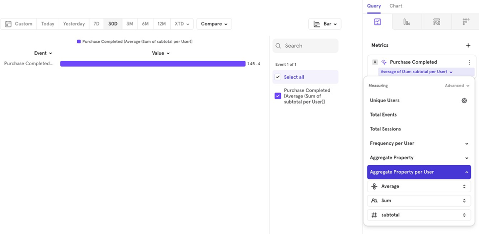
You can experiment with different combinations of aggregations.
The Metrics - User Profiles
You can visualize the number of User Profiles created or look at an aggregated value for a user profile property.
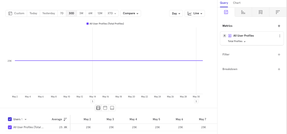
Example You might want to know how many distinct cities your users are from over the last 30 days.
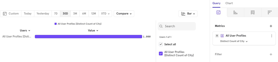
You can apply similar aggregations to user profile properties, just like you would on events.
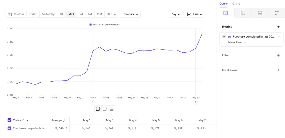
The Metrics - Cohorts
You can visualize how a cohort’s value changes over time.
For example, if you have a cohort of users who completed a purchase in the last 30 days, you can track how the number of users in this cohort changes day by day.
This helps you see how many users were in the cohort yesterday, the day before, and so on, allowing you to monitor trends over time.
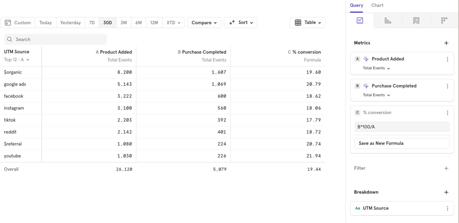
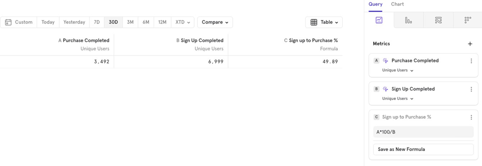
The Metrics - Formula
Mixpanel allows you to use basic arithmetic operations to create custom formulas based on your events.
For example, if you have two events—Sign up completed and Purchase completed— and want to calculate the Sign up to Purchase conversion percentage for last 30 days, you can easily create a formula for it.
Rolling Average
You can view a rolling average for your metrics. For example, if you want to see the 7- day rolling average of the sign-up to purchase conversion rate, Mixpanel will show a line chart with the % averaged over the past 7 days.
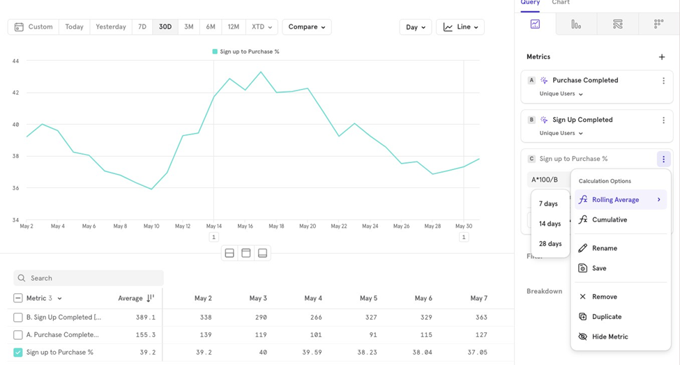
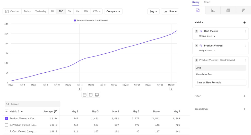
Cumulative
You can also visualize cumulative values over time. For example, if you want to see the cumulative number of users who viewed a cart plus those who viewed a product, you can use a formula for that.
Supported operators in formulas
Mixpanel supports the following operators for formulas:
- + Add
- - Subtract
- * Multiply
- / Divide
- () Parentheses to control the order of operations
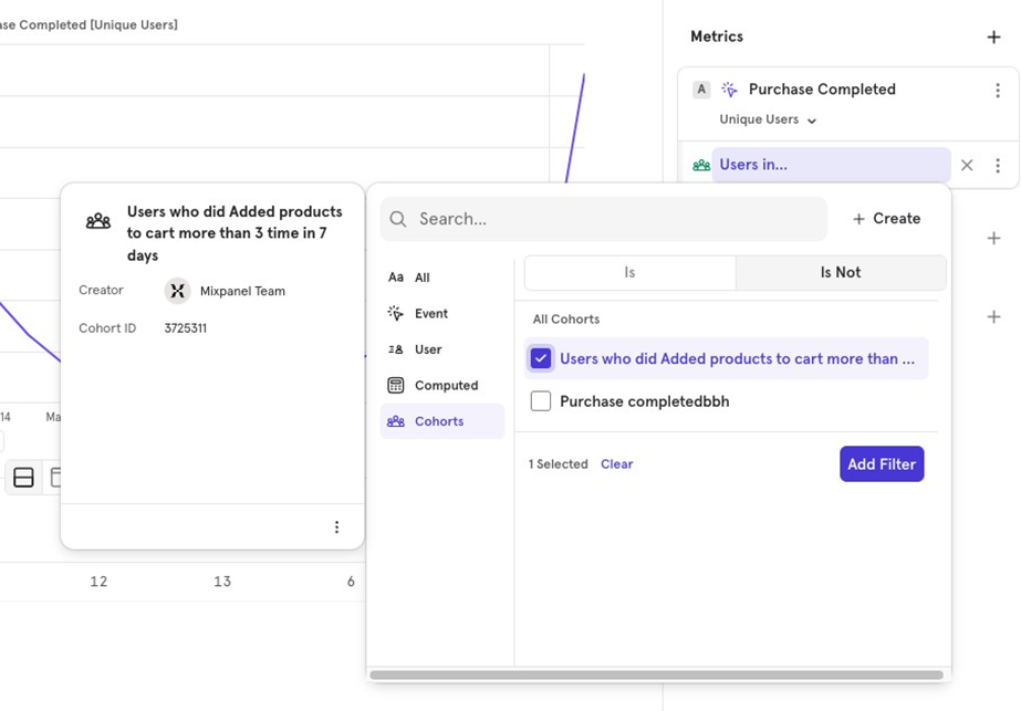
Filters
Filters allow you to narrow down the data you’re visualizing based on:
- Event properties Properties tied to a specific event.
- User properties Properties tied to the user.
- Cohorts Users who belong or don’t belong to a specific cohort.
- Computed properties Aggregated properties used as filters.
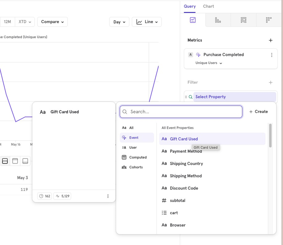
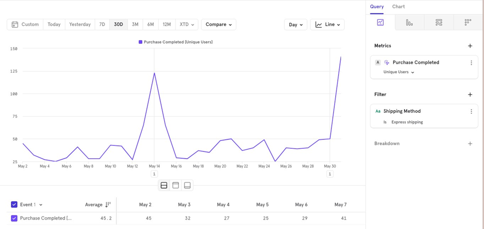
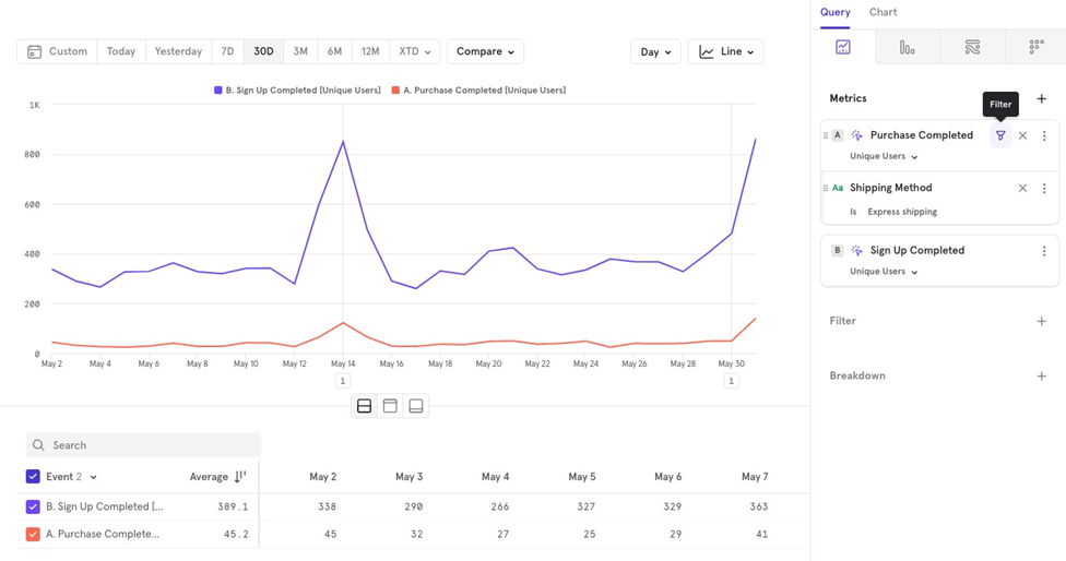
For example, if you want to look at purchases completed only for Express shipping orders, you would apply a filter based on shipping method.
Global Filter
Applies to all metrics you’ve chosen. It is applied after the data is queried.
Example: Looking at Purchase Completed and Sign Up Completed, but filtering for users only from the US.
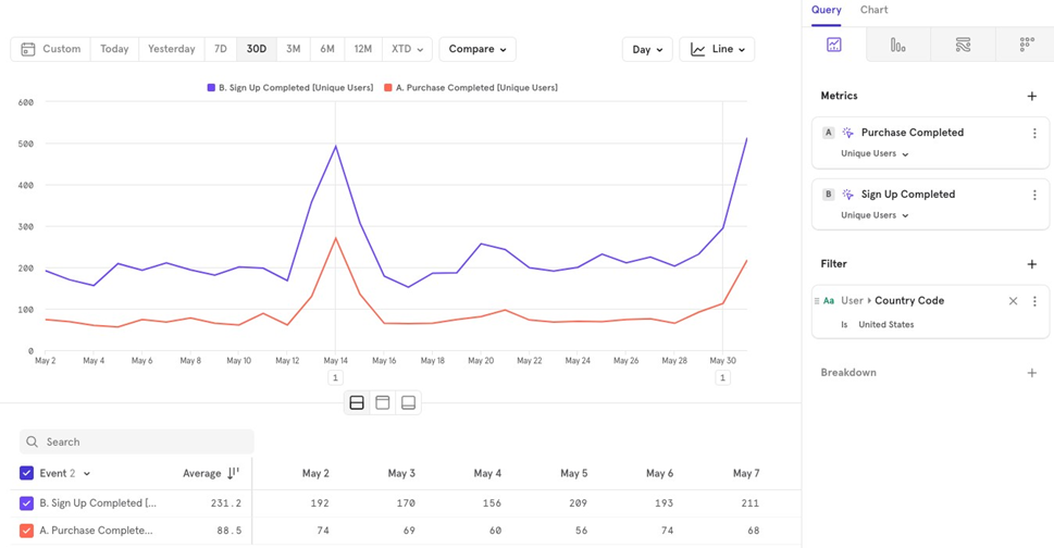
Note: If a property only exists in one metric, other metrics wonʼt show up in the chart.
Local Filter
Example: Viewing Purchase Completed via Express shipping along with the number of users who signed up. The shipping method filter only applies to Purchase Completed.
Filters Advanced
- Cohort Filtering You can choose whether users are in or not in a cohort. By default, it filters for users in the cohort. To change this, click on the cohort and select Is Not.
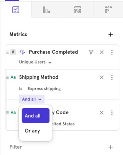
- AND/OR Logic When filtering by multiple properties, you can choose between AND (both conditions must be met) or OR (either condition can be met). For example, look at users who purchased via Express Shipping AND are from the US or users who purchased via Express Shipping OR are from the US.
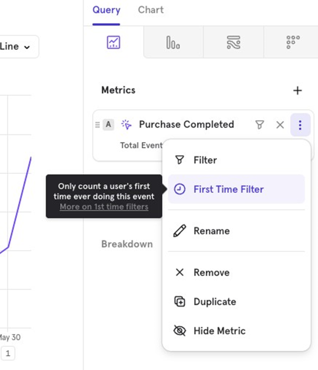
First Time Filter Mixpanel provides a default First Time Filter that can be applied to any event. When used, it only counts the first time a user performed the event, regardless of the date range you’re viewing. For example, if you apply the First Time Filter to the Purchase Completed event for the last 30 days, it will show users who made their first-ever purchase in the last 30 days.
Breakdowns
Similar to Filters, Breakdown allow you to divide the data you’re visualizing based on:
- Event properties Properties tied to a specific event.
- User properties Properties tied to the user.
- Cohorts Users who belong or don’t belong to a specific cohort.
- Computed properties Aggregated properties used as filters.
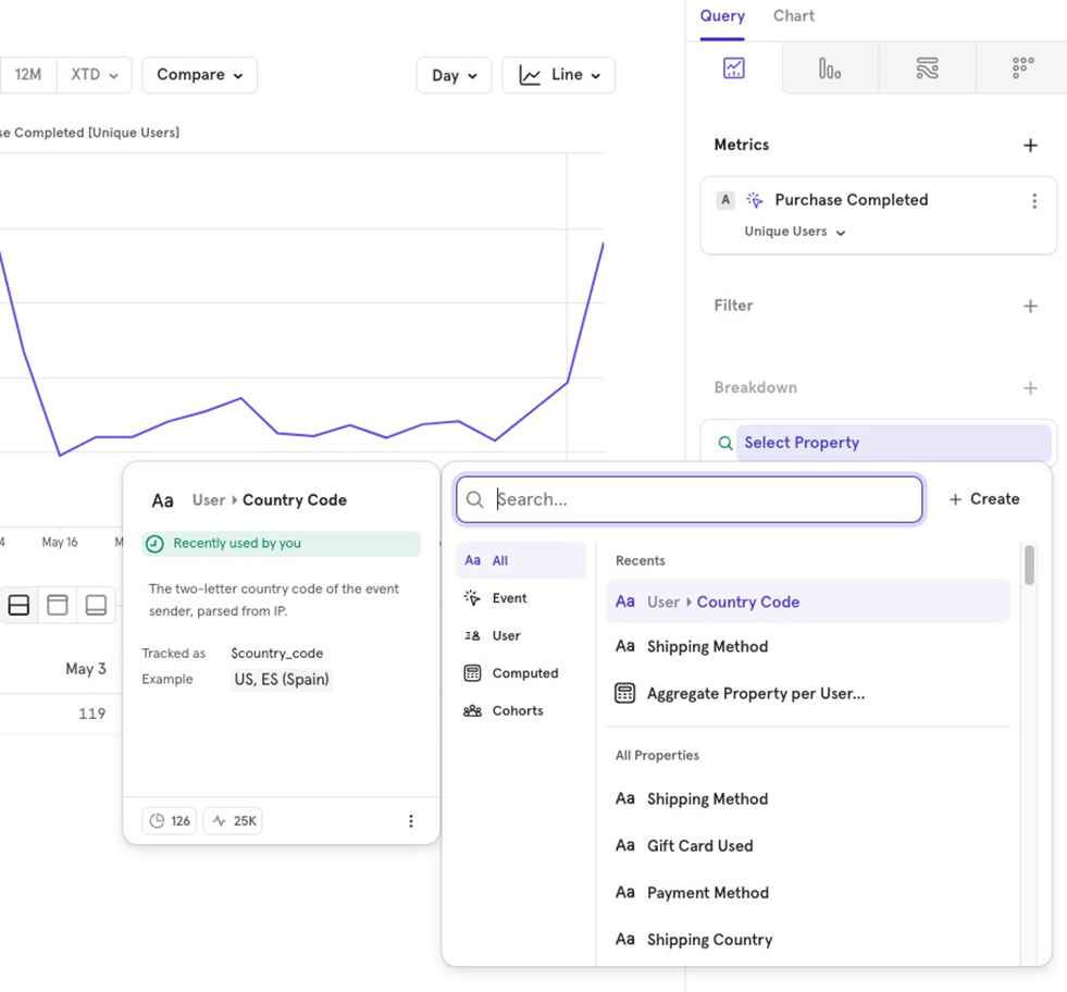
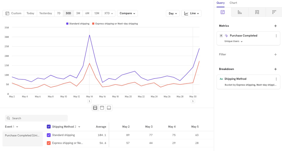
For example, to view Purchase Completed broken down by Shipping Method, you would add a breakdown on the shipping method property.
Note If a user has orders with multiple shipping methods, they will be counted once for each shipping method.
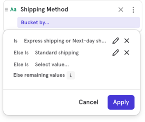
Customize buckets
If you want to group certain values together, use Customize Buckets to combine them for visualization.
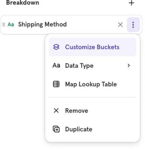
Example You can group Express Shipping and Next Day Shipping together and keep Standard Shipping separate for easier analysis.

![[Week 28] Learning Mixpanel: Computed Properties](/content/images/size/w600/2026/02/e73fb366-1c52-4f79-a28f-4a0b60d6998c_836x723.png)
![[Week 27] Learning Mixpanel: Bucket Customisation Types](/content/images/size/w600/2026/02/a81f7bcb-4886-4711-b1b8-af8c5fc6b1b8_463x476.png)
![[Week 26] Learning Mixpanel: Mastering Attribution with Mixpanel](/content/images/size/w600/2026/02/4e3a164c-bfb1-479f-9f09-2f8890eac413_885x787.png)