[Week 14] Learning Mixpanel: Frequency Analysis
![[Week 14] Learning Mixpanel: Frequency Analysis](/content/images/size/w1200/2026/02/8643c815-03b0-405f-b083-1c828c62fdf4_485x402.png)
Introduction
Welcome to Week 14 of Learning Mixpanel. I’m Ansh, a Mixpanel Certified Partner. I’ve had the privilege of working with 60+ startups, helping them set up their analytics infrastructure and gain actionable insights using Mixpanel.
Curious about my work? Check out my website for case studies, testimonials, and more details about what I do.
Tired of Mixpanel data going wrong - events missing, properties breaking, or random spikes?
Pravix makes it simple to detect these issues and keep your data clean.
Today, I’m going to talk about how to measure frequency in Mixpanel
Let’s get into it
If your preferred consumption is audio visual - access the video on Youtube
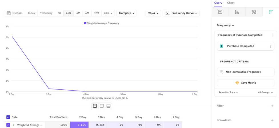
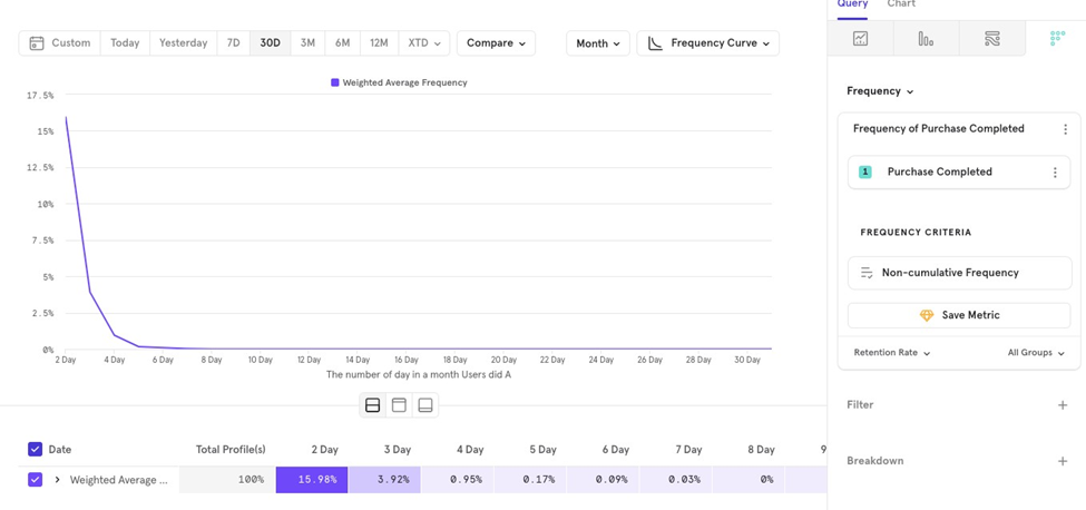
The Frequency Report helps you understand how often users return to your app within a specific time frame (e.g., daily, weekly).
Example: You might want to know what percentage of users who made a purchase in the last 30 days purchased on 2 days in a week, 3 days in a week, and so on.
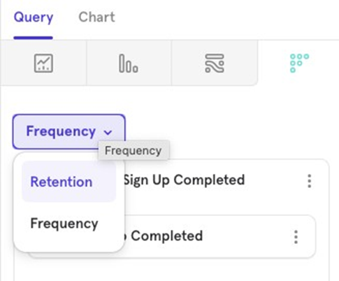
Frequency consists of 5 key parts:
- Metric
- Grouping
- Frequency Criteria
- Measurement
- Chart Type
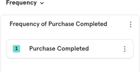
Metric
This is where you select the event to analyze frequency.
Grouping
You have 3 options for grouping user actions when analyzing frequency within a period:
- Hours in a day
- Days in a week
- Days in a month
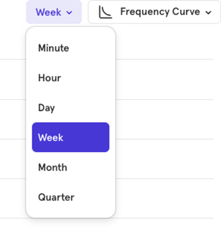
For example, you might want to see the percentage of users who make a purchase on 2 or more days in a month.
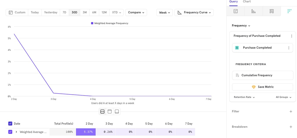
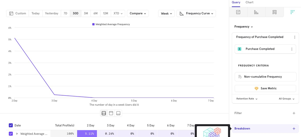
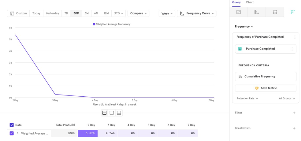
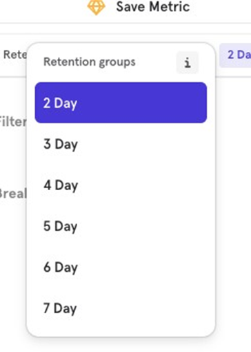
Frequency criteria
Choose the method to calculate frequency using either Cumulative or Non- Cumulative options.
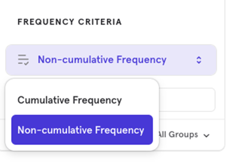
Cumulative Frequency
This shows users who performed the event at least a certain number of times in the selected period.
Example: The percentage of users who made a purchase at least 2 days in a week.
Non -Cumulative Frequency
This shows users who performed the event exactly a certain number of times in the selected period.
Example: The percentage of users who made a purchase exactly 2 days in a week.
Measurement
You can choose between two options:
- Frequency Curve (% of users)
- Unique Users (absolute number of users)
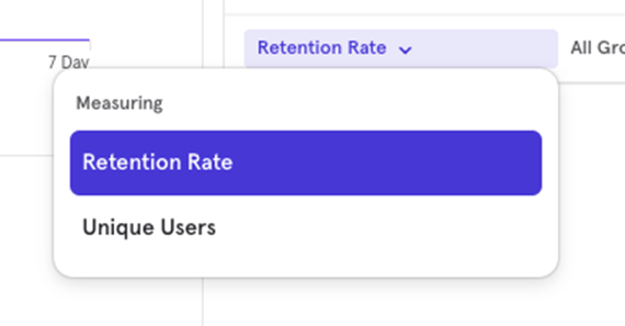
Frequency Curve
The Frequency Curve shows what percentage of users come back and perform the event within the selected time interval.
Example: What percentage of users come back at least 2 days in a week to make a payment.
Unique Users
This shows the absolute number of users who come back and perform the event within the specified time interval.
Example: The number of users who come back at least 2 days in a week to make a payment.
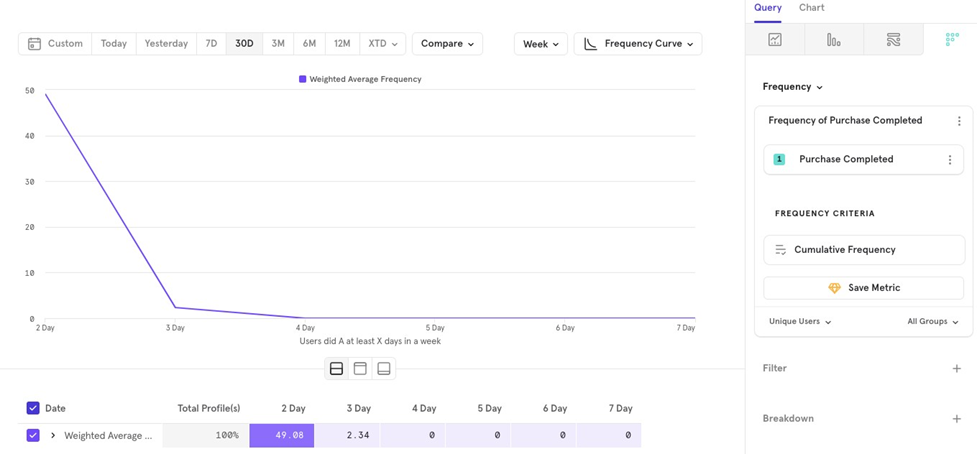
Chart Type
The Frequency report offers 3 chart types:
- Frequency Curve (what we’ve been using so far)
- Line
- Metric
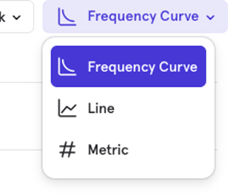
Line Chart
The Line Chart shows how the frequency for a particular period changes over time. For example, you can see how the percentage of users who purchase at least 2 days in a week has changed over the last 30 days.
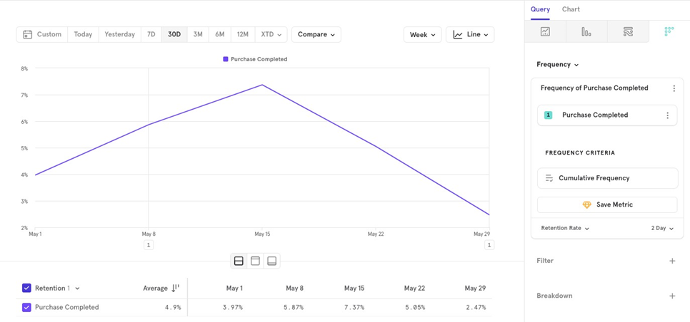
Unlike the Frequency Curve, the Line Chart shows a single time period (e.g., 2 days a week) and tracks it over time. You can choose different periods to compare, like at least 3 days a week instead.
Metric Chart
The Metric Chart gives a summarized view of the frequency for a specific period. For example, you can view the average percentage of users who made a purchase at least 2 days a week over the past 30 days.
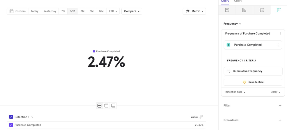
Similar to the Line Chart, you can choose the time period to compare.

![[Week 28] Learning Mixpanel: Computed Properties](/content/images/size/w600/2026/02/e73fb366-1c52-4f79-a28f-4a0b60d6998c_836x723.png)
![[Week 27] Learning Mixpanel: Bucket Customisation Types](/content/images/size/w600/2026/02/a81f7bcb-4886-4711-b1b8-af8c5fc6b1b8_463x476.png)
![[Week 26] Learning Mixpanel: Mastering Attribution with Mixpanel](/content/images/size/w600/2026/02/4e3a164c-bfb1-479f-9f09-2f8890eac413_885x787.png)