Overview of the Insights report
Mixpanel's Insights tab is a powerful tool for visualizing trends over time, distributions, frequency per user, etc.

Mixpanel's Insights tab is a powerful tool for visualizing trends over time, distributions, frequency per user, etc.
It can help you answer questions such as:
- Number of users signing up daily
- Distribution of the country where my users are coming from
- Total revenue generated
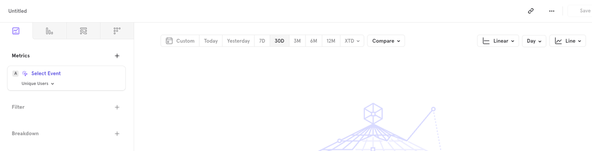
Before we get started to create reports, let’s take a look at how the Insights tab appears, & break it down into 5 parts for easier understanding.
Choosing what to measure
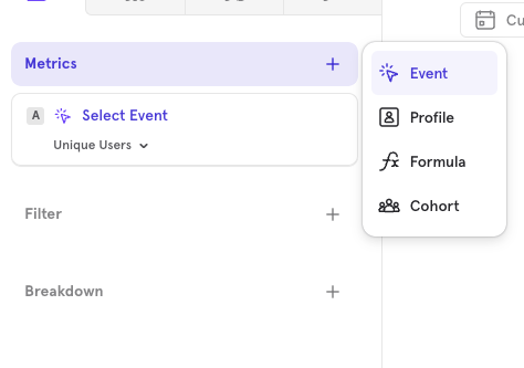
To start, you can measure a variety of data points in the Insights tab:
- Events: Track specific user actions.
- Cohorts: Analyze groups of users based on shared behaviors or characteristics.
- Profiles: Measure users.
- Formulas: Create custom formulas to analyze complex metrics.
You can include multiple events or cohorts in a single report, offering flexibility in how you view and interpret your data.
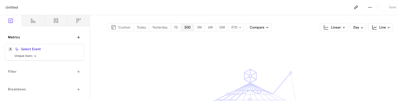
Filtering events and selecting Metrics
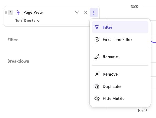
Click the three dots next to an event to apply filters, such as the "First Time Filter," which isolates instances where users perform an event for the first time.
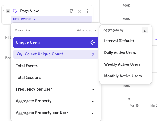
Decide whether to measure unique users, total events, sessions, or aggregate data based on properties to customize how you view the event data.
Breakdown
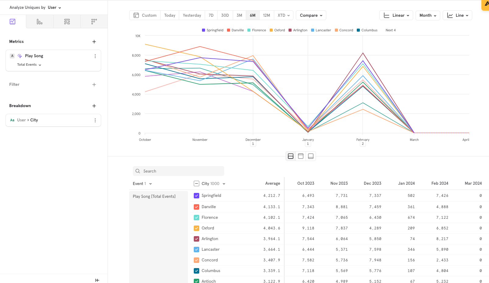
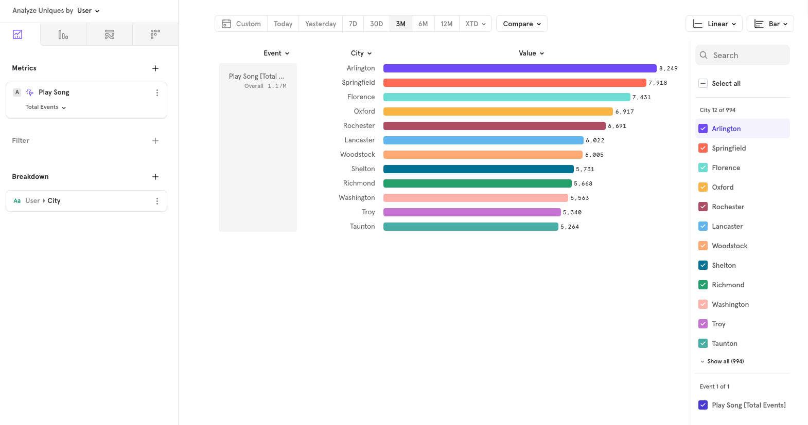
Enhance your analysis by breaking down event data by specific properties. For example, you could break down "Play Song" views by city, providing geographical insights into user behavior.
Changing timeframes
Adjust the timeframe for your data analysis using the toolbar. You can set a custom range or use predefined intervals (e.g., 30 days).
Additionally, the compare feature allows you to benchmark data against past performance (day, week, month, etc.) or against other user segments.

Choosing Chart Type
Customize how you visualize the data:
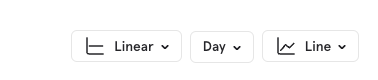
- Choose between linear and logarithmic scales.
- Select the aggregation level (daily, weekly, etc.).
- Pick a chart type (bar, line, pie, stacked bar) to best represent your data and make it easier to interpret.
Using Insights to Build Charts
Here are some practical examples of how you can use the Insights tab to create informative charts:
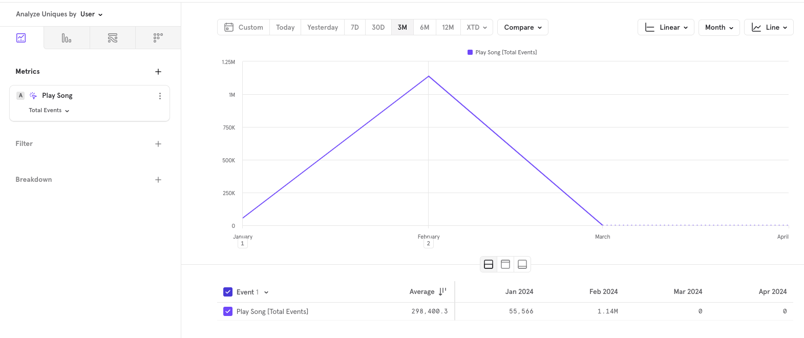
Total Play song Over Three Months: Set the interval to monthly to observe trends over the last quarter.
Browser Distribution for Play Song: Break down the play song events by the city to understand which songs are most popular among your users.
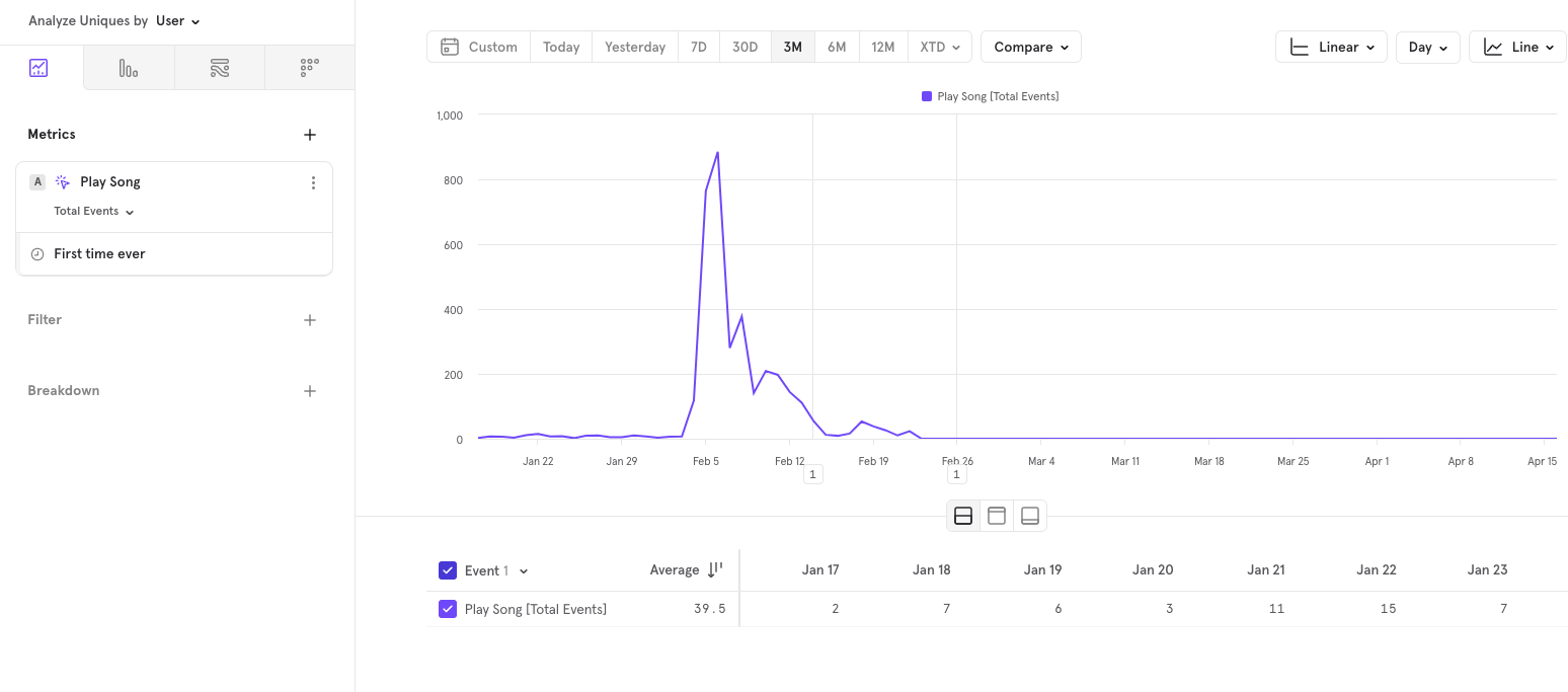
New Users Playing Songs: Track the total unique users who play songs for the first time daily to gauge new user engagement.
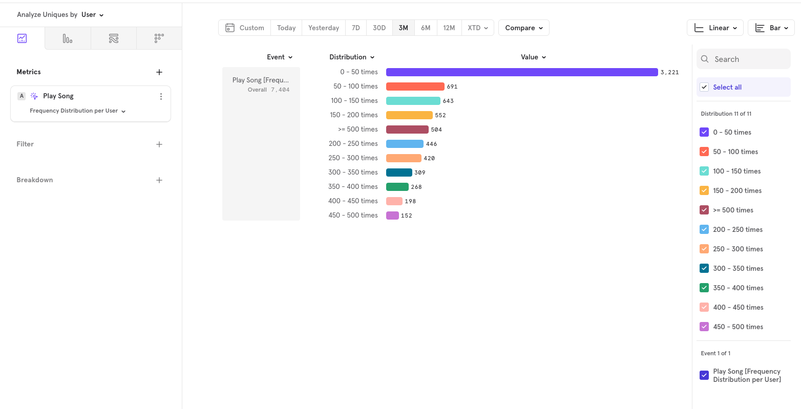
Play Song Frequency: Analyze the distribution of how many song plays occur per user to identify levels of engagement.
Hope this was helpful. If you’re looking for any help with Mixpanel, feel free to reach out using any of the below methods.
LinkedIn | Email - anshdoesanalytics@gmail.com | Book a slot on my calendar