Segment analysis: finding which segments move a metric
Fugly is a segment analysis that finds which segments move with a metric you care about. You build one table with every factor you suspect, run a classification model over it, and read off which segments convert well and which do not.
Say you want to know which SegmentA group of users who share something: a country, an acquisition channel, a signup method, a first-session length. Splitting a metric by segment is what makes it actionable.Glossary make a user purchase, and you have 50 things at the user level that could explain it. Country, city, age, onboarding role, how long the first session lasted, which product they activated on.
Testing one or two of those at a time gets you nowhere, because the answer is usually a combination. Fugly analyses all 50 at once, mixed and matched, and tells you which combinations convert and which do not.
A segment is just a group of users who share something, like "users in Germany" or "users whose first session lasted a long time". The name “Fugly” is not mine. It is what the team called it when I was at CRED, and it stuck.
When does segment analysis make sense?
Only once you have three things:
- Loads of data.
- Enough users in each segment that the numbers are significant. In plain words: the difference you see is unlikely to be random noise. A tiny segment that happens to convert well tells you very little.
- Many factors you want to test against, not just one or two.
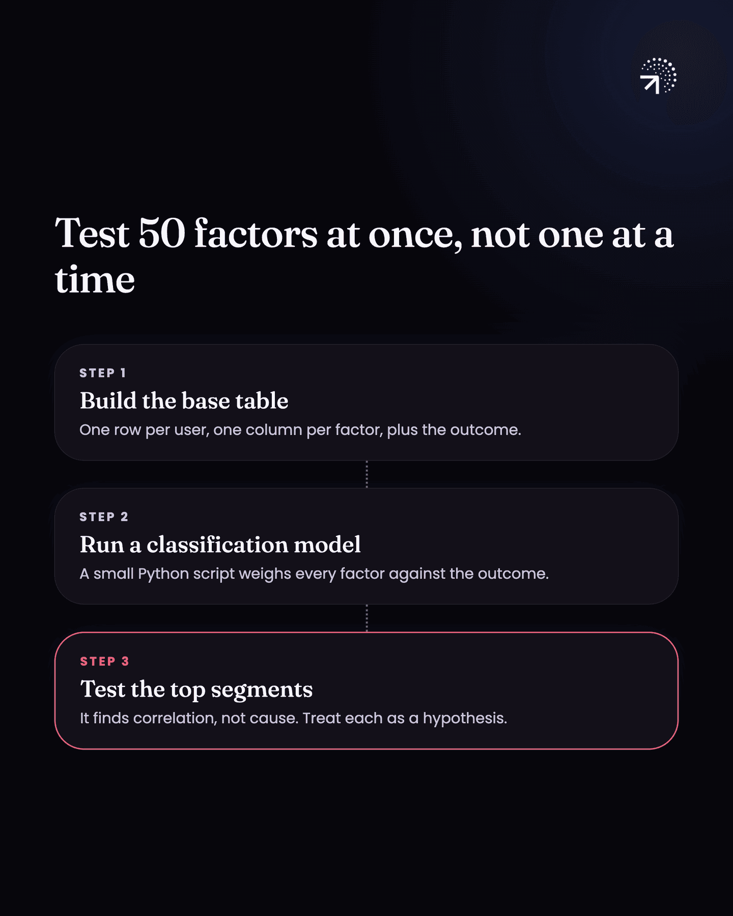
The whole thing is three steps: build the base table → run a classification model over it → test the segments it ranks highest.
| Step | What you do | What you get |
|---|---|---|
| 1. Build the base table | One row per user, one column per factor, plus whether they paid | Every factor side by side against the outcome |
| 2. Run a classification model | A small Python script over the table | Which groups of users are far more likely to convert |
| 3. Treat what it finds as a hypothesis | Test the segments it ranks highest | Whether the segment causes the payment, not just correlates with it |
How do you build the base table for segment analysis?
Each row is one user, and each column is a factor. If you are working on first-time payment, the columns are everything you think could influence payment:
- country
- city
- age
- onboarding role
- how long the first session lasted
- which product they activated on
- anything else you think could influence payment
Then one more column, the outcome: did this user pay, or not.
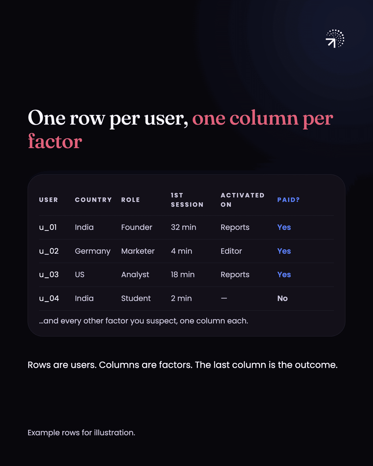
That is your base table. Build it in this shape because once every factor is its own column, the model can weigh all of them against the outcome together, so you stop guessing which one to check first.
Which model do you run over the base table?
From there you run a classification model over the table. That is a small Python script that looks at every row and learns which column values show up far more often for users who paid than for users who did not.
It will tell you which groups of users are far more likely to convert and which are not.
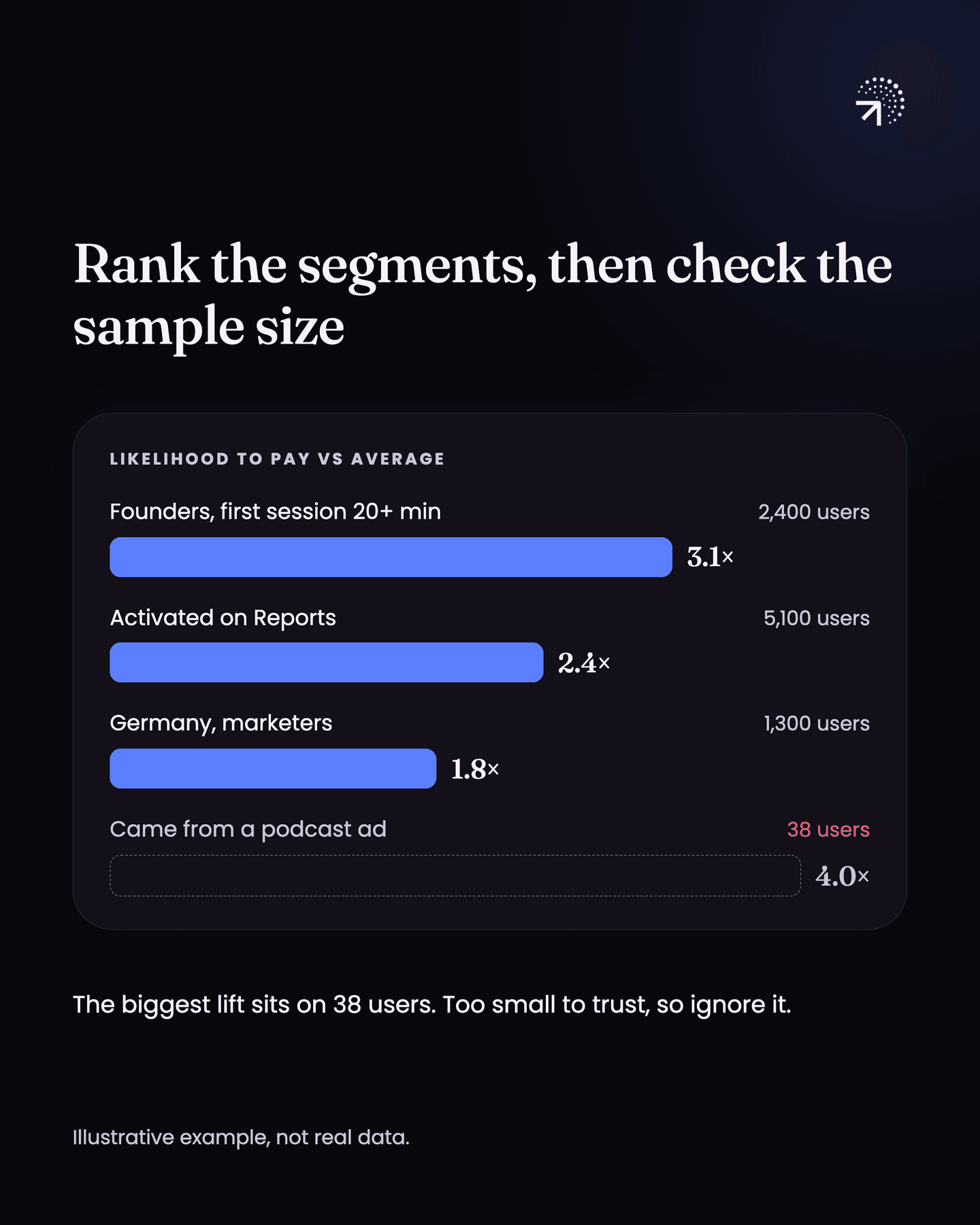
A decision tree is one classification model you can use for this. scikit-learn's decision tree guide describes it as learning simple decision rules from the data, and lists as an advantage that the result is simple to understand and can be visualised.
Why is every segment the model finds only a hypothesis?
Because the model finds CorrelationTwo things showing up together. It is where an insight starts, not where it ends: the users who do the thing may simply be your most motivated ones.Glossary, not cause. Be clear about what this gives you. Fugly ranks the segments that correlate with paying, meaning users in those segments pay more often. Whether anything about the segment causes the payment is a separate question, and the model does not answer it. Correlation is not causation covers how to test it.
That is a simple way to do Fugly, and it will tell you which segments convert and which do not.
Common questions
How do you find which user segments convert best?
Build one table at user level with every factor you suspect (country, city, onboarding answers, first session length, acquisition channel) and run a classification model over it. It reads all of them at once and surfaces the combinations that convert.
Does segment analysis tell you what causes conversion?
No. It gives you correlation. Everything it finds is a hypothesis that still needs an experiment or a conversation with users before you act on it.
When does segment analysis make sense?
Only once you have loads of data, enough users in each segment that the differences are unlikely to be random noise, and many factors you want to test against, not just one or two.
What model do you use for segment analysis?
A classification model: a small Python script that looks at every user row and learns which column values show up far more often for users who paid than for users who did not.