Data storytelling: building a dashboard people understand
A dashboard people understand opens on a question, orders its reports so each one follows from the last, and lands on an answer.
I get sent a lot of dashboards where you scroll through report after report and come away with nothing you can act on.
This chapter is for you if you're the founder or the PM building those dashboards. It's also for you if you have a data person building them and you need to tell them what good looks like.
Why doesn't anyone understand your dashboard?
The biggest mistake is treating a dashboard like a rough notebook, a scratch pad for your own digging.
A scratch pad
Every report that touches the question, dumped in one place and sent over for review. Stakeholders read all of it and understand none of it.
A dashboard that reads
It opens on a question, each report follows from the one before, and it lands somewhere. The reader can follow it without you in the room.
You have a question, say why people don't activate. So you dump every report that touches it into one place and send it over for review.
Your stakeholders open it. They go through all of it. They understand none of it.
The dashboard isn't telling them anything in order. It doesn't open on a question and it doesn't land anywhere, so there's nothing to follow.
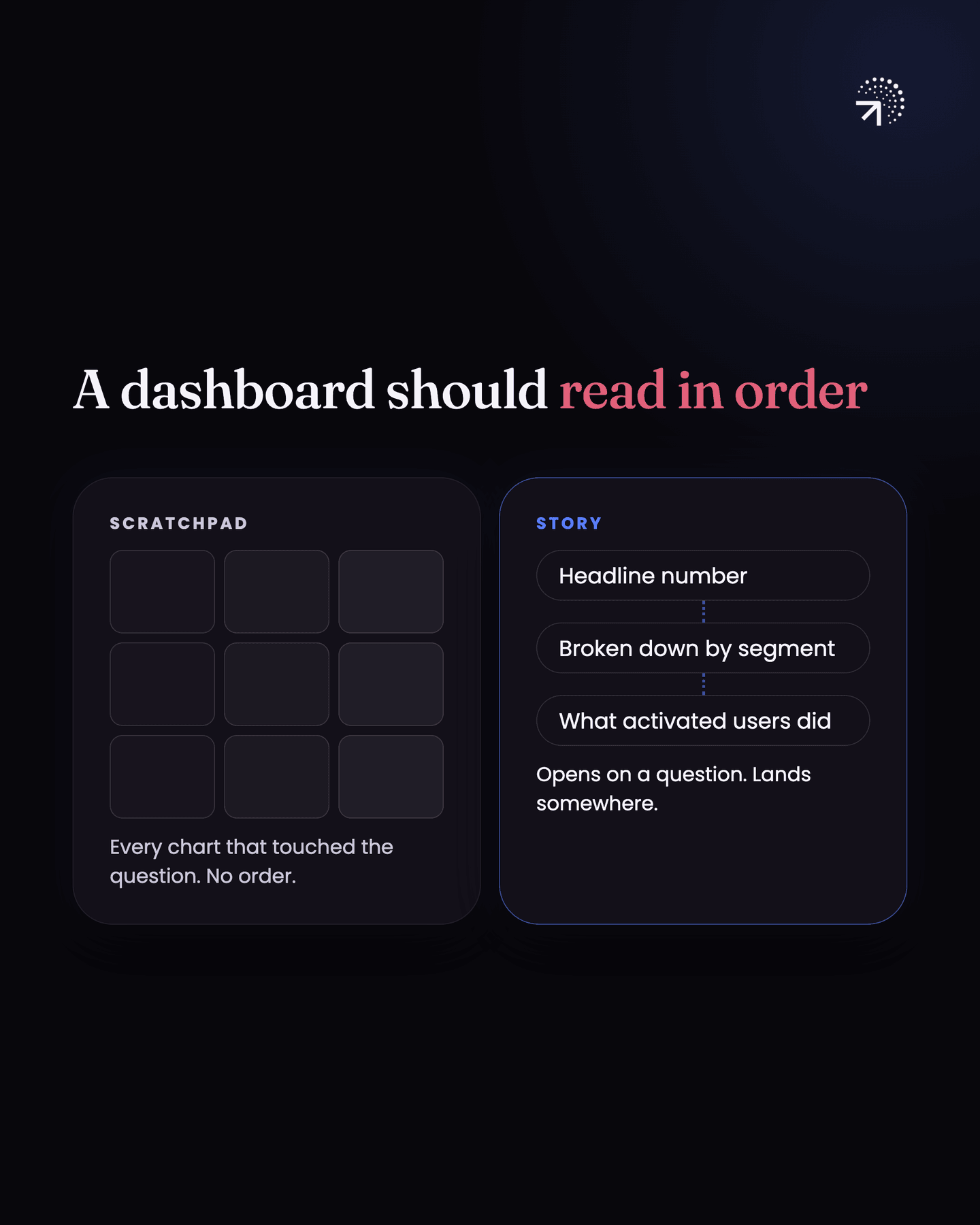
What has to happen instead is that the dashboard reads in order. From the first report to the last, it walks the reader through what's going on.
That doesn't happen on its own. You need a process for it.
What should you do before building a dashboard?
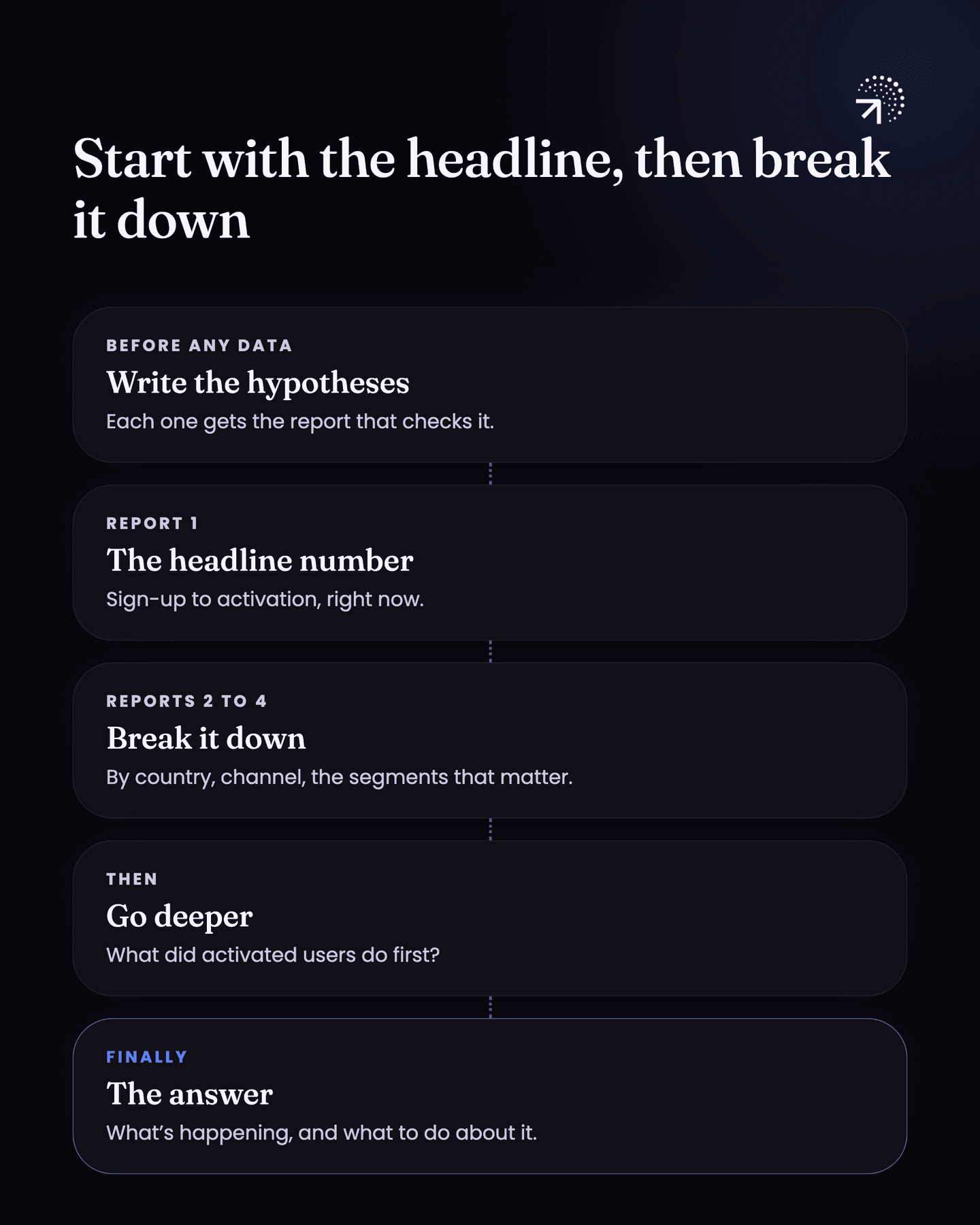
You write down the hypotheses you're going to check. This happens before you open any data.
A hypothesis is just a guess you can test. For low activation it could be "people from one marketing channel sign up but never set anything up" or "activation is fine in one country and poor in another."
If you go into the data without them, you're browsing. Clicking around and hoping something jumps out. You'll never come out the other side with a story.
Each hypothesis gets the report that checks it. That's what decides which reports go on the dashboard and which stay off.
How do you order the reports on a dashboard?
Start with the headline number, then break it down. Say you're working on activation, and signup to activation is low.
Your first report is the number itself. What is it right now?
The next few break that number down. What does it look like by country, by marketing channel, by whatever SegmentA group of users who share something: a country, an acquisition channel, a signup method, a first-session length. Splitting a metric by segment is what makes it actionable.Glossary (a slice of your users) you think matters?
Then you go deeper. The people who did activate, what did they do before that, and what does their behaviour look like?
| Order | Report | Example for low activation |
|---|---|---|
| First | The headline number | Signup to activation right now |
| Next | The number broken down | By country, by marketing channel, by segment |
| Then | Deeper behaviour | What the people who did activate did before that |
| Last | The answer | What it means and what to do about it |
Each report answers the question the one before it raised.
What happens if your dashboard has no story?
People won't understand your dashboards. It doesn't matter how good or how clear the reporting underneath is. If nobody understands it, nobody gets value from the work you put in.
There's a second cost, and it's the bigger one. When the reports are scattered, you can't read one chart against another and see what they mean together.
When the dashboard is built in order, you can. You read one report against the next, add the business context you already have, and something comes out of it: an idea, an insight, a thing that needs doing.
When it's all scattered, which is how most dashboards are, nothing comes out. You just have a lot of charts.
Common questions
Why doesn't anyone read my dashboard?
Usually because it's a scratch pad rather than an argument. Every report that touched the question got dumped in one place, in no order, so there's nothing for a reader to follow and nowhere it lands.
How should you structure a dashboard?
Open on the question it answers, order the reports so each one follows from the one before, and finish on the answer and what to do about it. The reader should be able to follow it top to bottom without you in the room.
What is data storytelling?
Presenting analysis so it reads in order: it opens on a question, each report answers the question the one before it raised, and it lands somewhere. The reader can follow it without you in the room.
Why write hypotheses before building a dashboard?
Each hypothesis gets the report that checks it, which decides what goes on the dashboard and what stays off. Without them you are browsing the data and hoping something jumps out.